This past October 10 – 11 we celebrated the thirteenth edition of the Brand New Conference in Salt Lake City, UT, and this year’s story begins almost immediately after last year’s Brand New Conference when we had the realization that we actually had no idea what made Salt Lake City, Salt Lake City and that our preconception that there was a lake that provided all of the table salt for the United States was absolutely wrong. Turns out, nobody in Salt Lake City cares about salt or the lake for that matter. So we decided to take a scouting trip to figure out what we were going to base the identity on. It was a good trip where we identified three key references.
References
No. 1: The Mountains
The first thing we noticed is that anywhere you look, wherever you are in the city, you will see mountains. Whether it’s the Wasatch Mountains to the East and North or the Oquirrh Mountains to the West, the mountains are a stunning sight. All times of day, all times of year.
Mountains as seen from our visit to Salt Lake City on October 26 – 27, 2023.
No. 2: The City Grid
Another element that stood out was the nearly perfect, city-wide grid, which has been in place for literally hundreds of years since Salt Lake City was founded in the 1840s.
Nineteenth-century map with a bird’s eye view of the city.
Map created in the 1850s based on the Pratt-Sherwood survey of 1847.
No. 3: Street Car Typography
Found inside The Pioneer Memorial Museum, an 1872 street car used by the city’s transportation system, Salt Lake City Lines (still in operation to this day), caught our attention with its hand-painted lettering because, well, look at it.
1872 street car.
References as Identity Elements
No. 1: The Mountains
For the mountains, we didn’t want to do anything too literal and just show brown, pointy triangles. We wanted to somehow capture the layering of the different heights and depths of the mountains and how they blend into each other as they intertwine in the background.
In previous years we usually solve challenges like this in digital form first before figuring out how to replicate them in print and/or another physical production method months later but this time it was the opposite as we had an inkling of an idea of how we could abstract the mountains.
Early experiments to recreate the mountains.
Our idea was to literally layer mountains by dying paper (and eventually fabric) in hues of brown getting progressively darker, along with a touch of blue for the sky, and leaving some paper free of color to represent snow-capped mountains. Playing with liquid and powdered dyes (and a combination of both) we eventually found a winning formula.
Flat sheets for program cover with layered mountains and sky.
We then gave these to our third-time collaborator, GEO, and asked him to translate them into a digital asset we could use as the identity’s background. The mountains appear at first peaceful but sudden movements are meant to represent exaggerated tectonic shifts that, while we are no geologists and have no idea whether that statement is scientifically correct, it sounds awesome as a design concept. The motion behaviors in the previous two conferences had been fast-paced and very much in your face so this year we wanted to go to the other end of the spectrum and make the motion of the background slow and moody.
No. 2 + No. 3: The City Grid + Street Car Typography
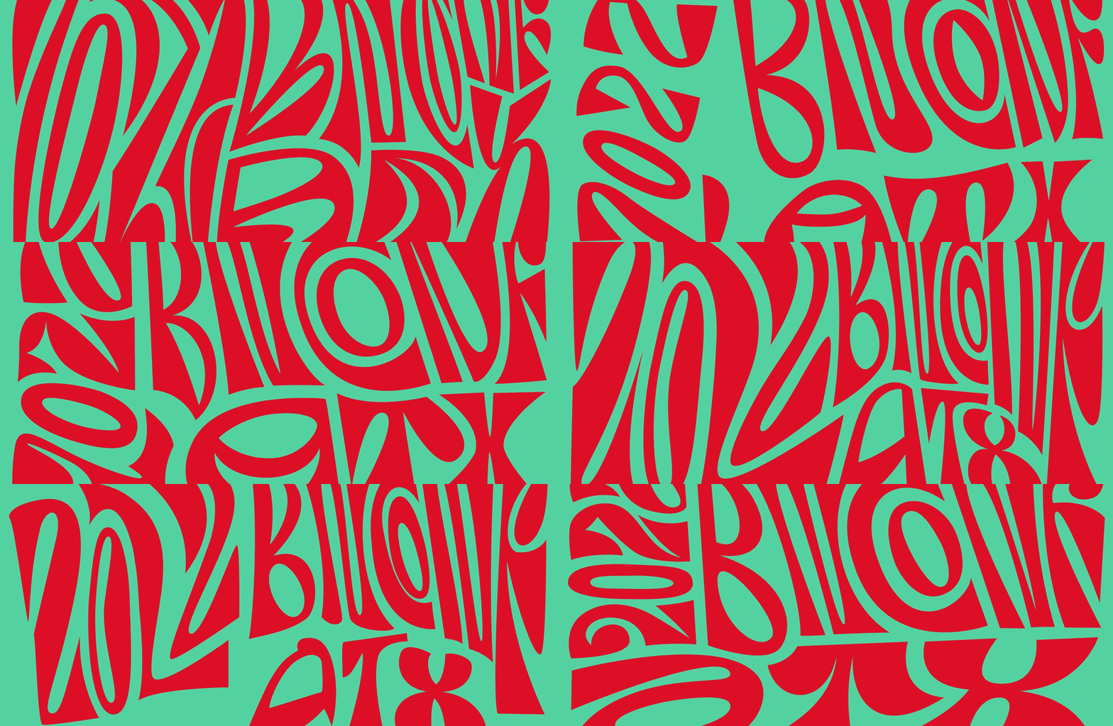
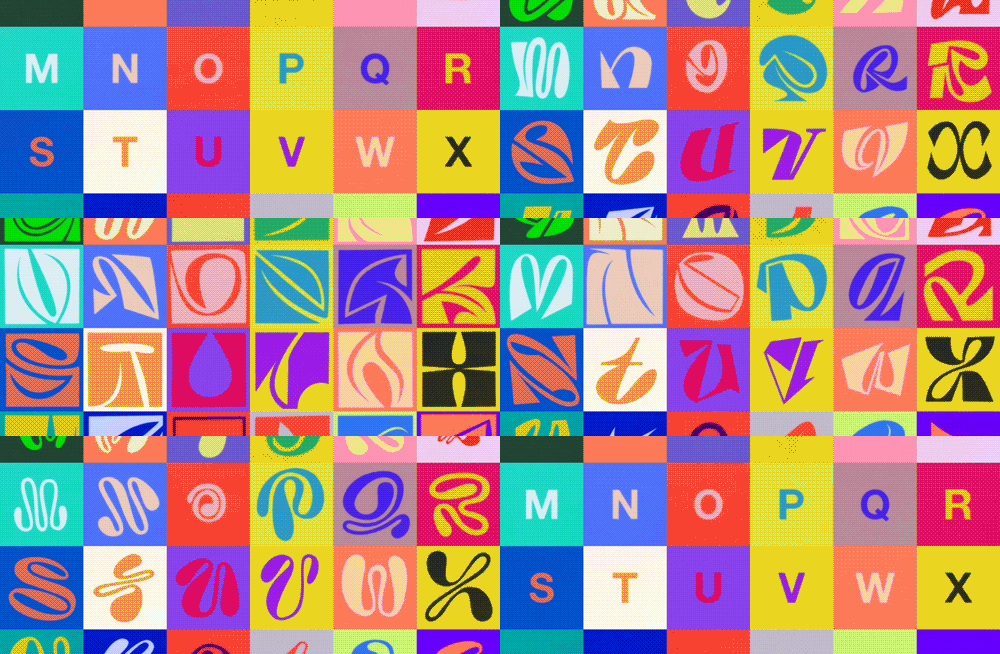
As soon as we had seen the hand-painted typography on the street car we knew it would become the cornerstone of the identity in all its quirky glory. We are not type designers and the sample set of letters was very limited so we also knew we needed reinforcements. Enter XYZ Type, the type foundry run by Ben Kiel and Jesse Ragan. We reached out to them to see if they would want to take on the challenge of creating a full typeface from a mere 13 sample letters. On top of that we added the challenge that we wanted it to be a monospace typeface because we wanted the typesetting to feel like the city grid on the 1850s map. After some healthy back and forth, Plumbago was born. You can read a more in-depth take on the design of the typeface over at XYZ Type’s website.
Plumbago. Designed by XYZ Type.
Plumbago can adhere to SLC’s city grid.
As usual, we don’t have a formal logo or a single lock-up and this year’s grid approach lended itself to a number of compositions and configurations where no space is left unused and grids within grids are created to place smaller bits of text within the name of the event, replicating the map with each lot singled out within each city block.
“Logo” compositions.
Details of the map.
The supporting typography is also inspired by the same map and its lovely and meticulously hand-drawn typography. We selected a trio of some of the more normal choices available from Taylor Penton’s hefty collection of hand-drawn typefaces so as not to distract too much from the primary typeface but still capture that early-settler typography from the nineteenth century.
Typographic palette.
Website and Social Media
With all of our digital elements in place, the first task was the website. The previous two years we had used the same structure and bones with different skins and while we tried to do the same for a third time in a row, this year’s visual language demanded its own layout and treatment, especially because, perhaps a little controversially, we elected to do every block of text in a centered arrangement, which might be too much for longer paragraphs but once you center one thing, it’s hard not to center everything else.
For Instagram posts, we kept things fairly straightforward with the mountains in the background with different executions of the typography and logo compositions on top. Eagle-eyed viewers might notice some colored gradients in some of the assets below that don’t repeat again on the website or in the print materials. The reason for that is that, once we started with the physical production, we realized it was going to be a nightmare to get those gradients right consistently, so we abandoned them early on and kept the sky blue at all times, which ended up giving us a simpler color palette for a cleaner look. We also tried a flipboard-train-schedule-like treatment on the typography early on but it wasn’t working either. We could have probably edited the gradients out and not shown the flipboard animations but we put both things in here as they were part of the process to help us get to a more cohesive system.
Speaker quotes, generated and posted live.
Opening Titles and Speaker Intros
For the third year in a row, GEO designed the opening titles and speaker introductions based on music custom-made by Norbert Herber, who is also back for another round of us providing cryptic art direction that he somehow manages to translate into sweet, sweet music. This year’s prompts for Norbert were: A) Trent Reznor (but a happy Trent Reznor), B) Ennio Morricone, and C) something gospel-y but not too religious. We also provided this doozy: “The tempo should be chill chill chill build up build up BUILD UUUPPPPP chill chill chill build up build up BUILD UUUPPPPP and with each build up, the intensity escalates”. This all led to a combination of the sound of Earth cracking, mountains sprouting from the pits of hell, bells tolling, metal clanking, and enough rumble to shake your innards, all made more amenable by some synth beats. You can never not do right with synth beats.
For the speaker intros, Norbert created three different 10-second arrangements and GEO created three different motion templates that we then rotated amongst the 20 speaker intros.
A bonus 10-second sting was created to signal that the event was resuming after a break and that it was time to pay attention.
Let’s get Physical
As usual, we tested our limits (and sanity) with the physical applications as we decided that each of the 1,000 programs, tote bags, and t-shirts were going to be hand-dyed to yield completely unique compositions of mountains and sky, each requiring four separate passes to achieve the layering effect. It took a lot of trial and error to find the right approach and formulas for each item and we ended up doing the bulk of the work in an unexpected environment.
Various testing products and formulas.
Early successful prototypes.
Regarding the “unexpected environment” mentioned in the previous paragraph… long story short: After the 2023 Brand New Conference we decided to purchase a moving truck to help us move all of our finished materials from our headquarters in Bloomington, IN, to wherever the conference might be each year. A tough investment upfront but considering the shipping charges we end up paying each year, we figured we would break even after five years while gaining a lot of flexibility of what we can do in the interim. What we didn’t expect was that the truck would become production central for 2024.
Production environment: A 15-foot box truck.
We know what you are going to ask and the answer is: Yes, of course we created a design for the truck.
The official Brand New truck.
Alright, let’s get into it!
Programs
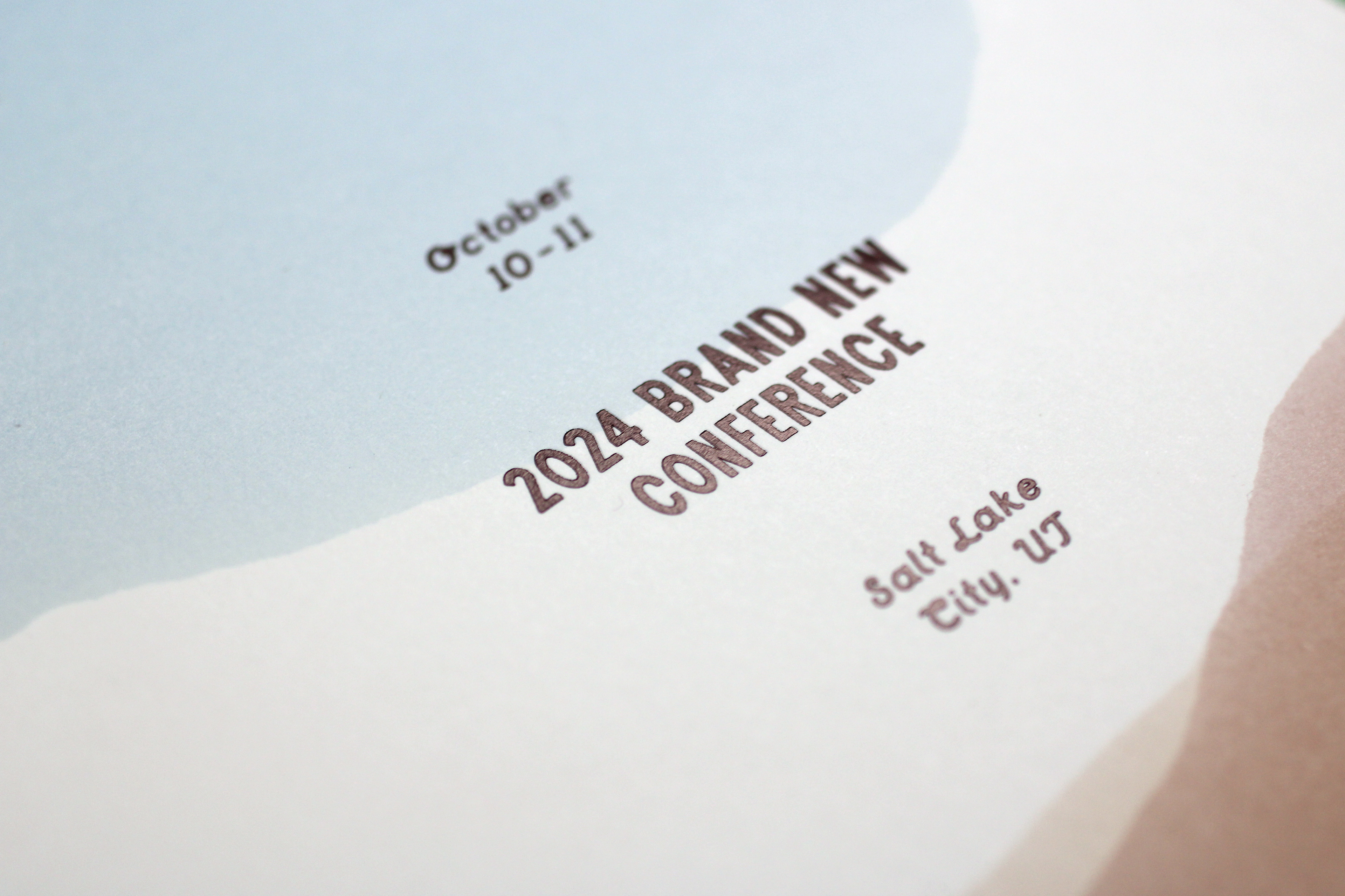
The first item we took on was the cover for the programs. One thing to note at this moment is that, yes, we could have easily created 10, 15, or 20 different compositions digitally and then printed those over and over and save ourselves a huge chunk of time and headache but whenever we encounter what would be the simplest solution to something we run away in the opposite direction.
The four separate passes for each sheet: Three mountains and one sky.
Keeping the sheets sorted for their respective next step.
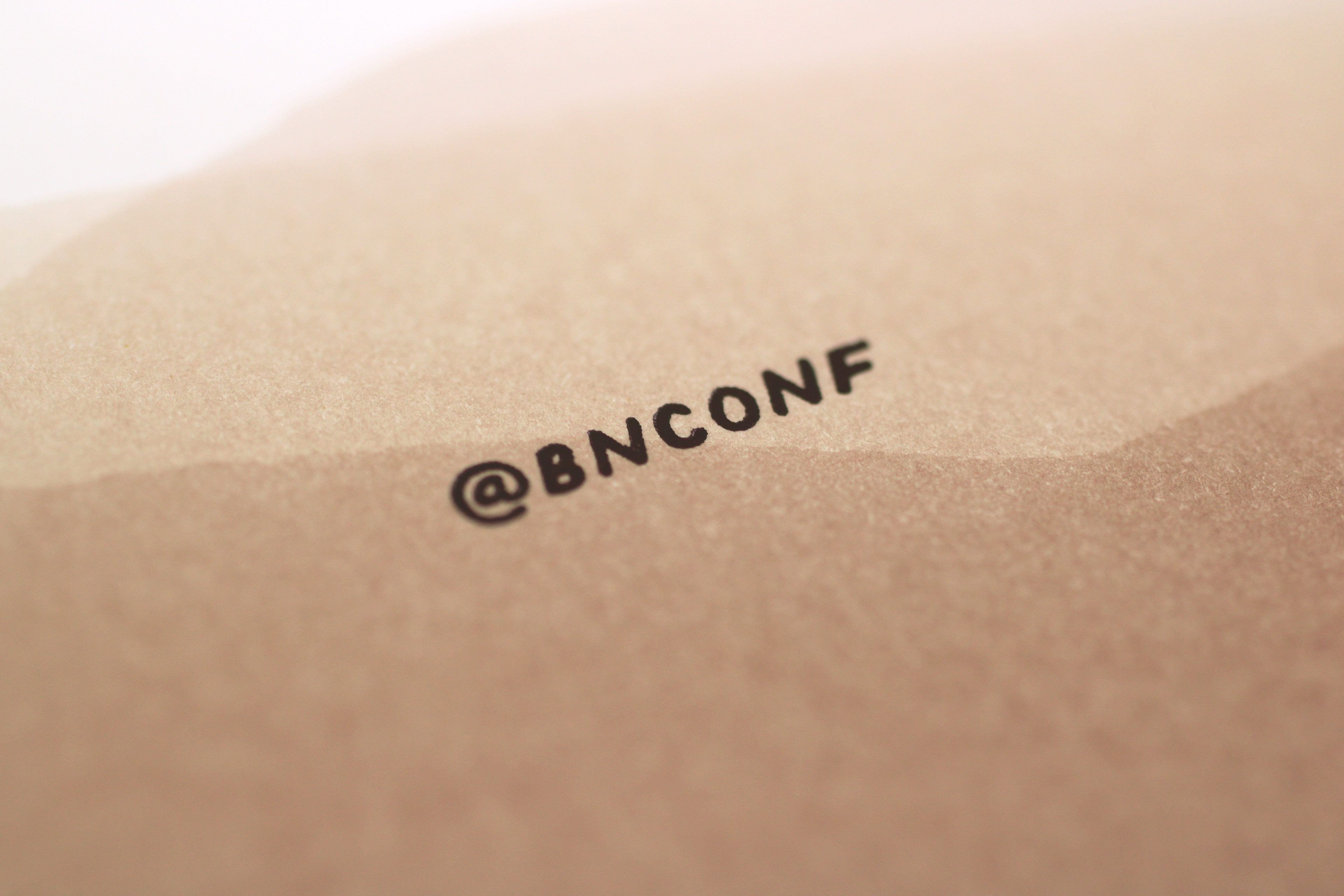
Samples of the front and back covers.

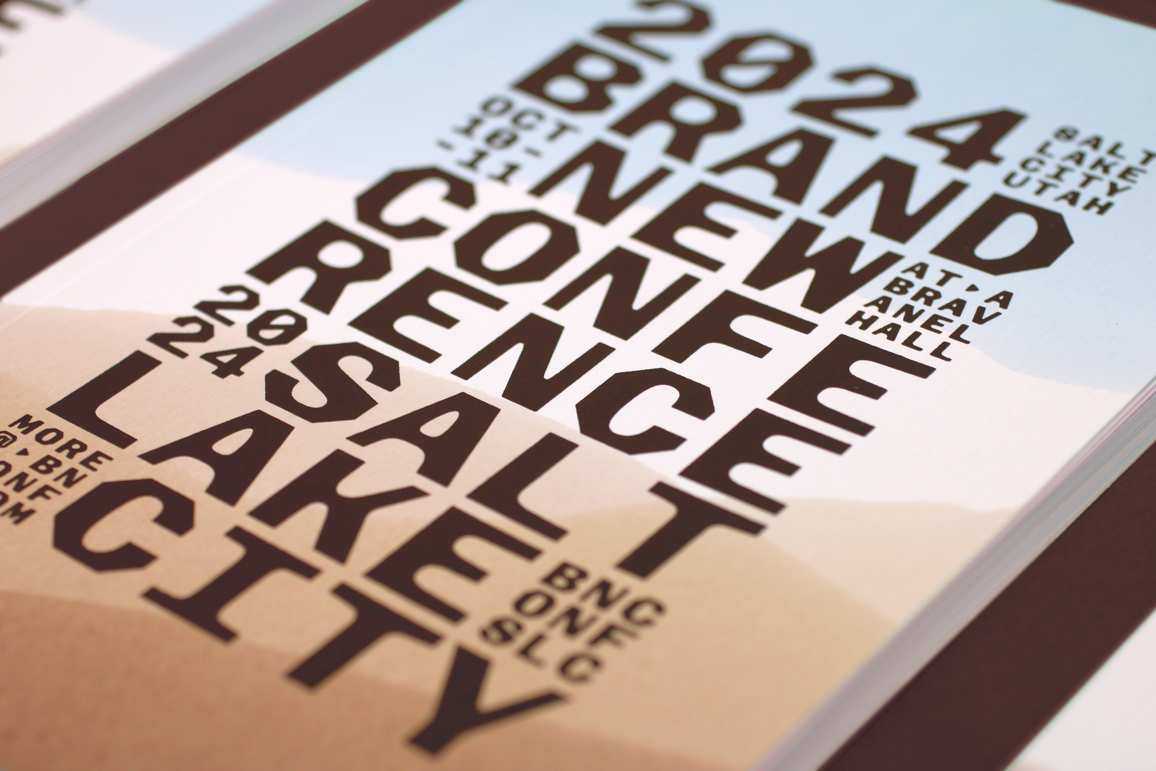


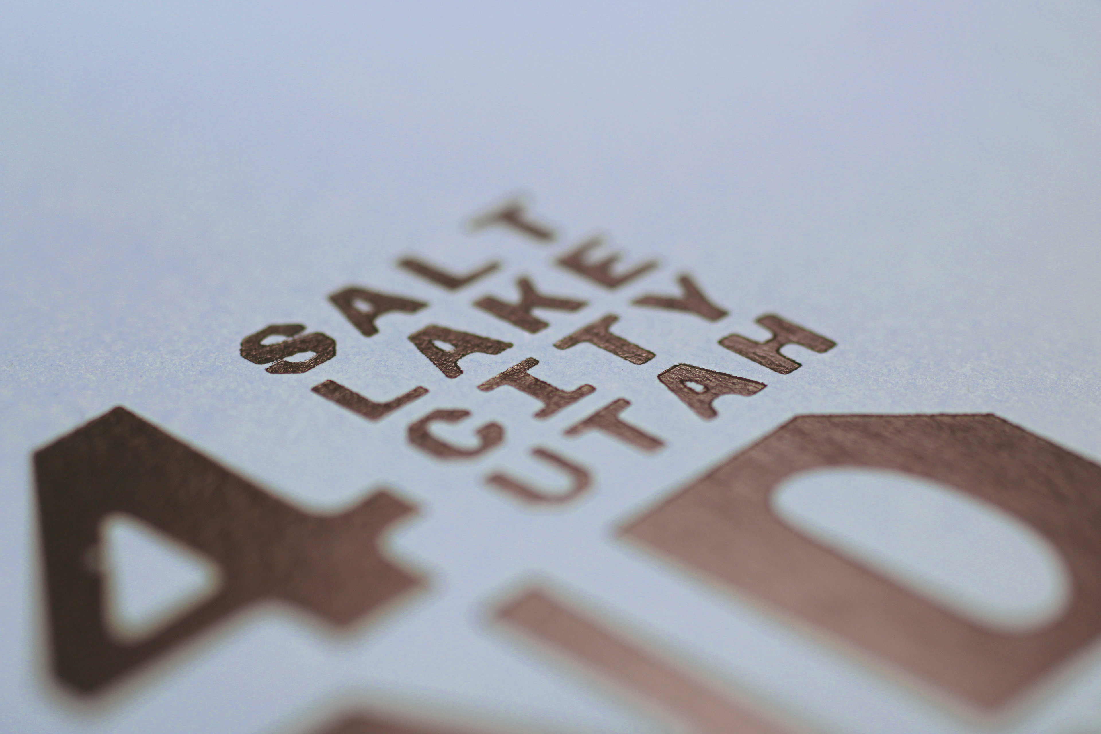
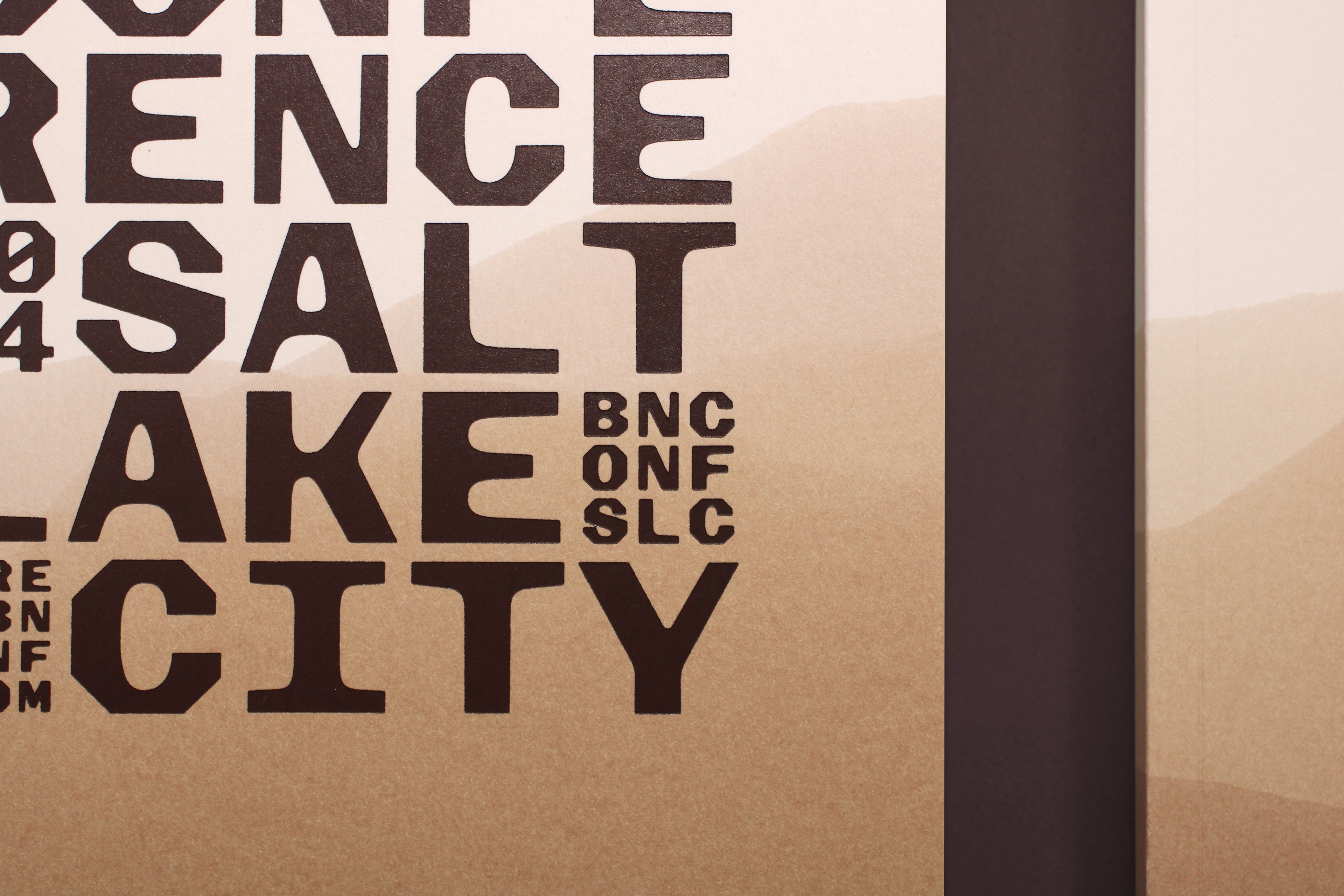
Programs.
Tote Bags
Moving from paper to fabric brought on a slew of challenges as the materials behaved very differently and required different dyes. While the papers were relatively easy to dial in using RIT liquid dyes, the tote bags (and T-shirts) required powdered, reactive dyes, along with a few pre- and post-dying chemicals to, first, prep the fabric for absorbing the dye and then, second, to keep dye from coming off after washing it. Also, they were more difficult to handle because of, well, the handles.
Each pass, each day, required mixing dyes and other chemicals in very specific quantities and order.
One thing that was very annoying about the bags is that they remained wet for a while and if they even barely touched each other, the dye would transfer from one bag to the other so they couldn’t be hung to dry in the yard first because the wind would make them rub so after dripping them in the truck we had to first put them in the garage for half a day and we had to move one in each hand at a time.
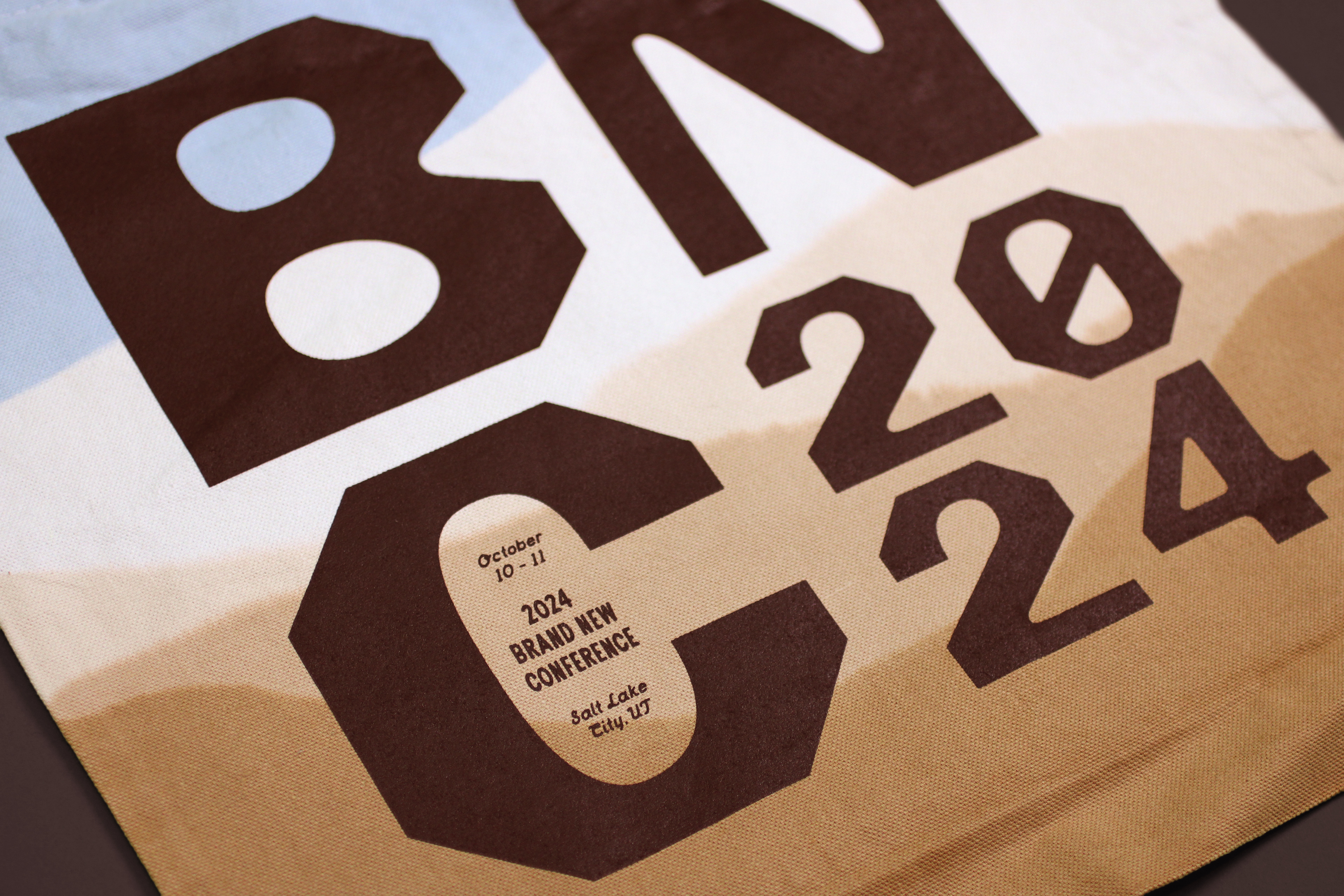
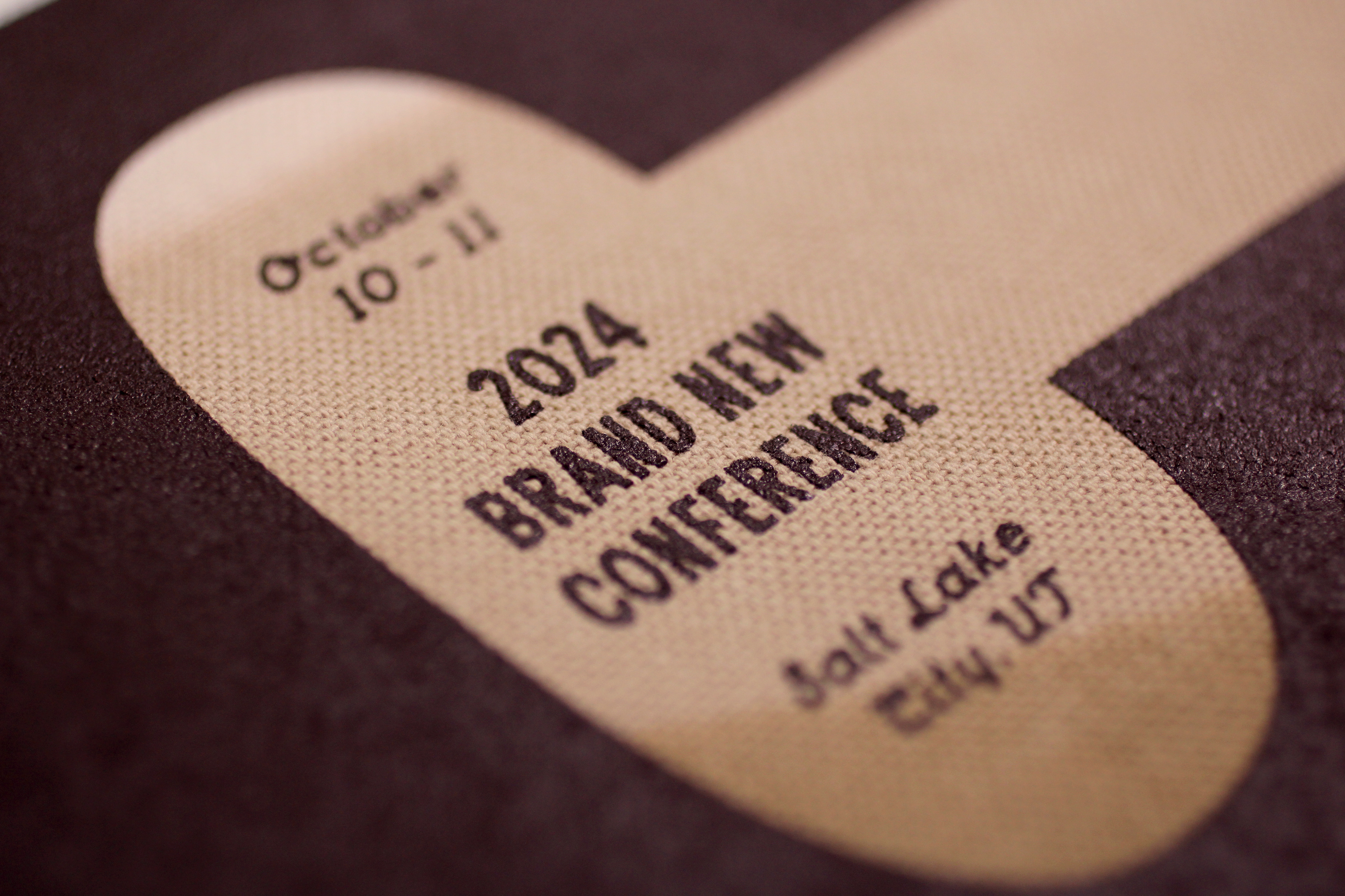
Tote bags.
Tote bags in action.
T-shirts
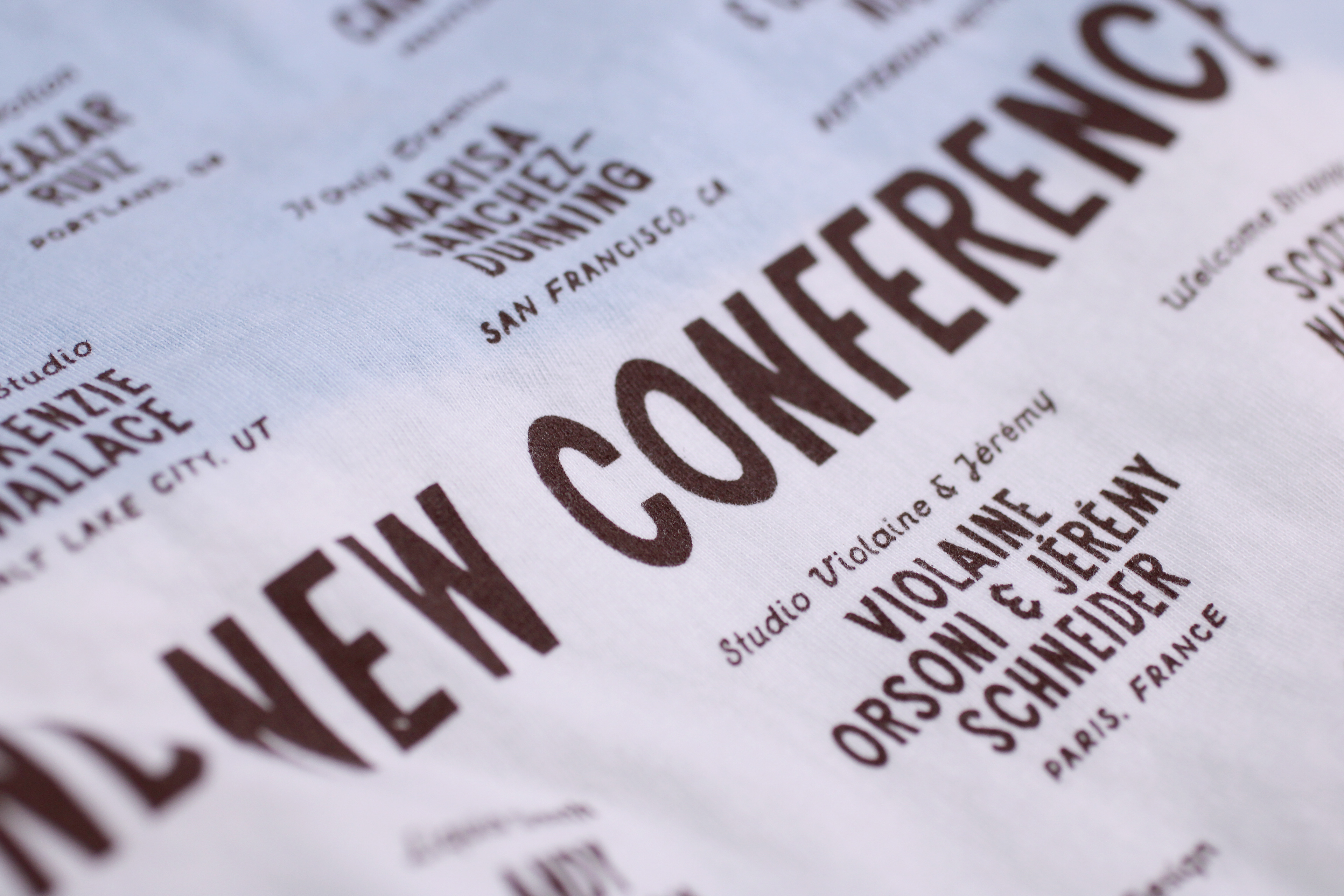
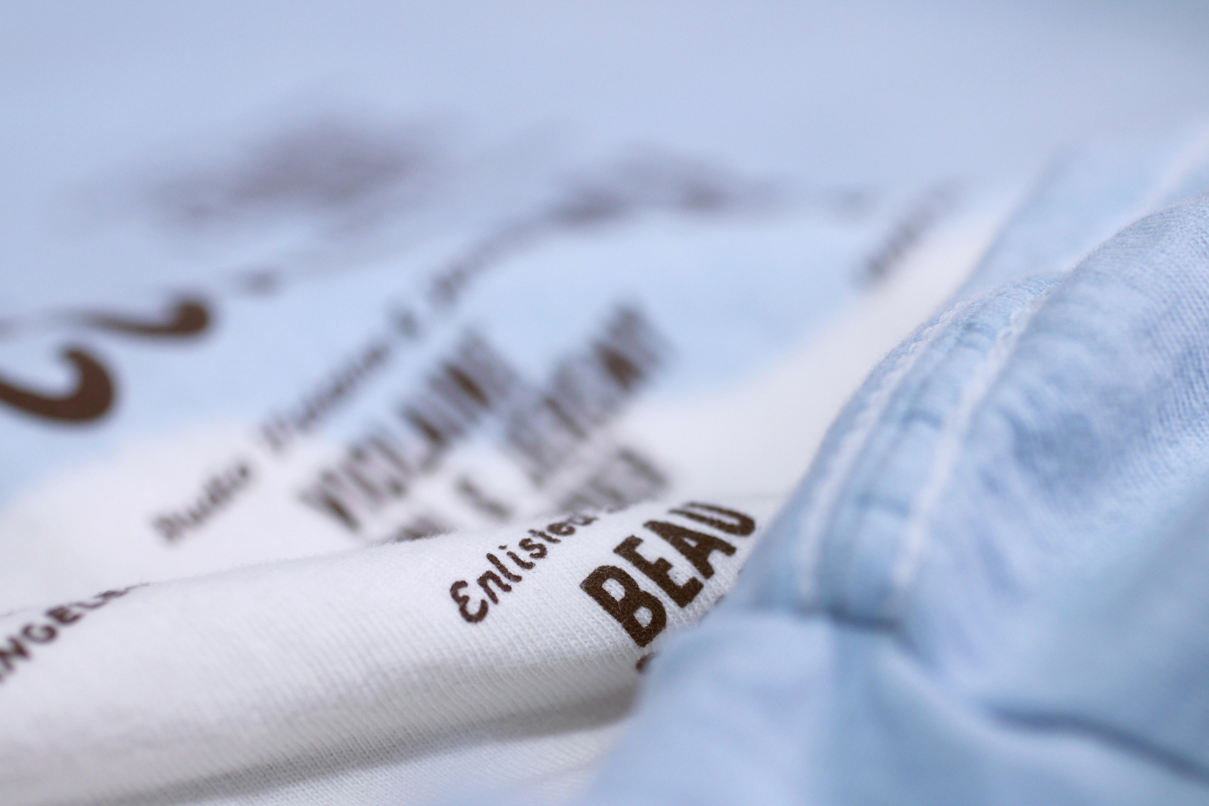
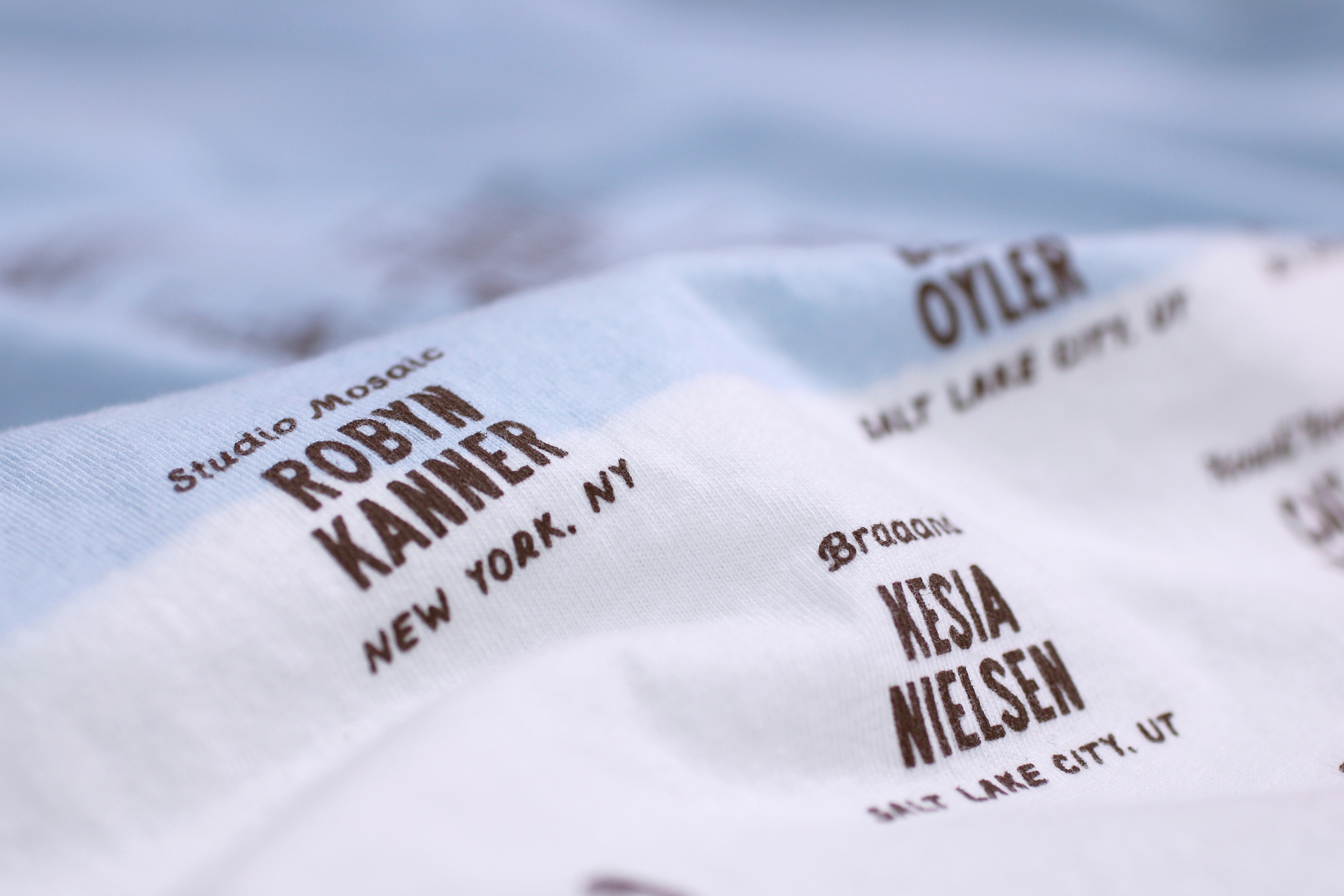
At first we thought the tote bags would be the hardest but the T-shirts were no walk in the park, especially because now we were dealing with different sizes, so dying an XS T-shirt is a very different experience than an XXL but they all still shared the same process, which started with pre-washing all of the T-shirts with Synthrapol, a chemical that helps lock in the dyes. Washing 1,000 T-shirts is not easy so we headed to our local laundromat to make a first dent in the inventory. (Afterwards we did the rest at home.)
With the t-shirts we started with the sky instead of the mountains because we wanted to make sure the sleeves were covered in blue, which would then dictate the amount of mountain coverage needed on each T-shirt size.
After washing all of the T-shirts after the dying process — each load requiring two passes in the washer before going into the dryer — the “ironing” process for the t-shirts was different. We didn’t use the heat press because that thing is unforgiving and any little wrinkle transforms into a crease that will never flatten so they had to be flattened by hand.
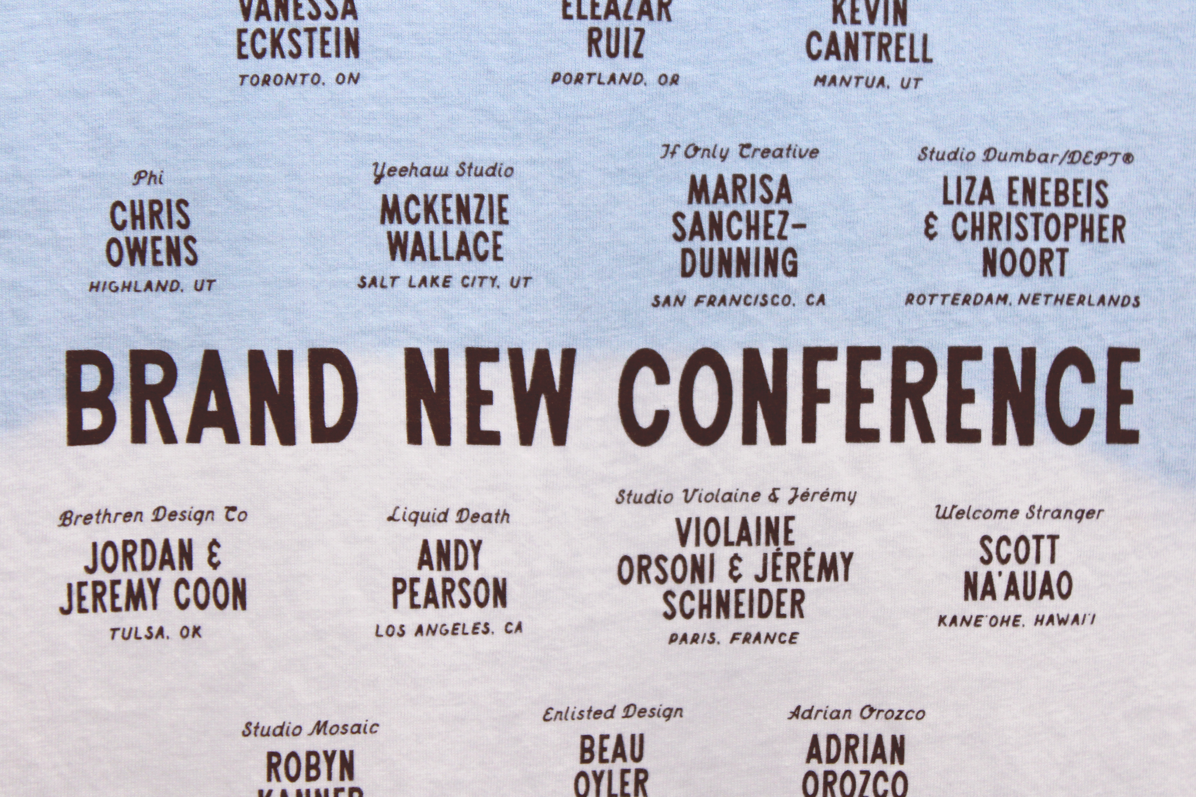
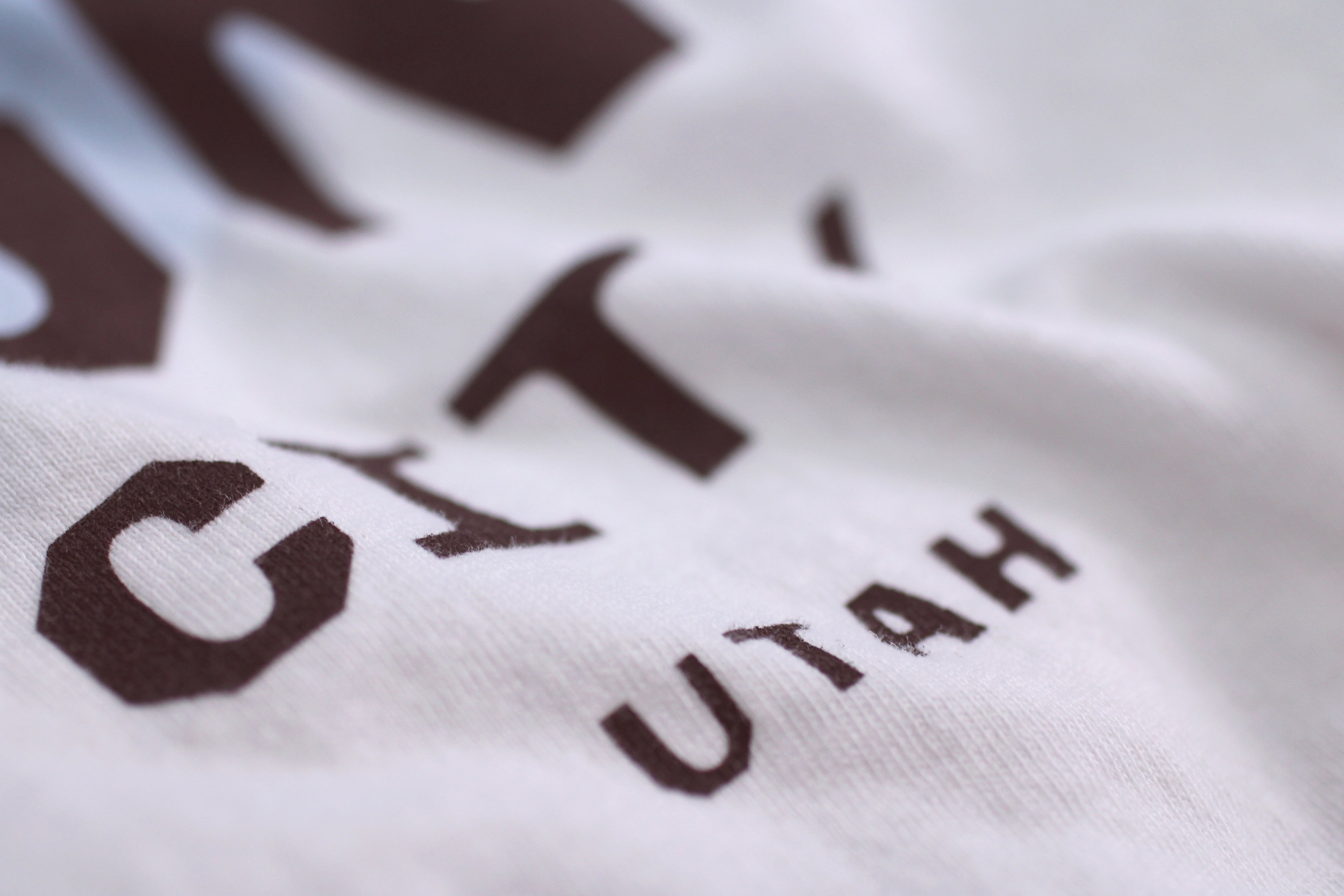
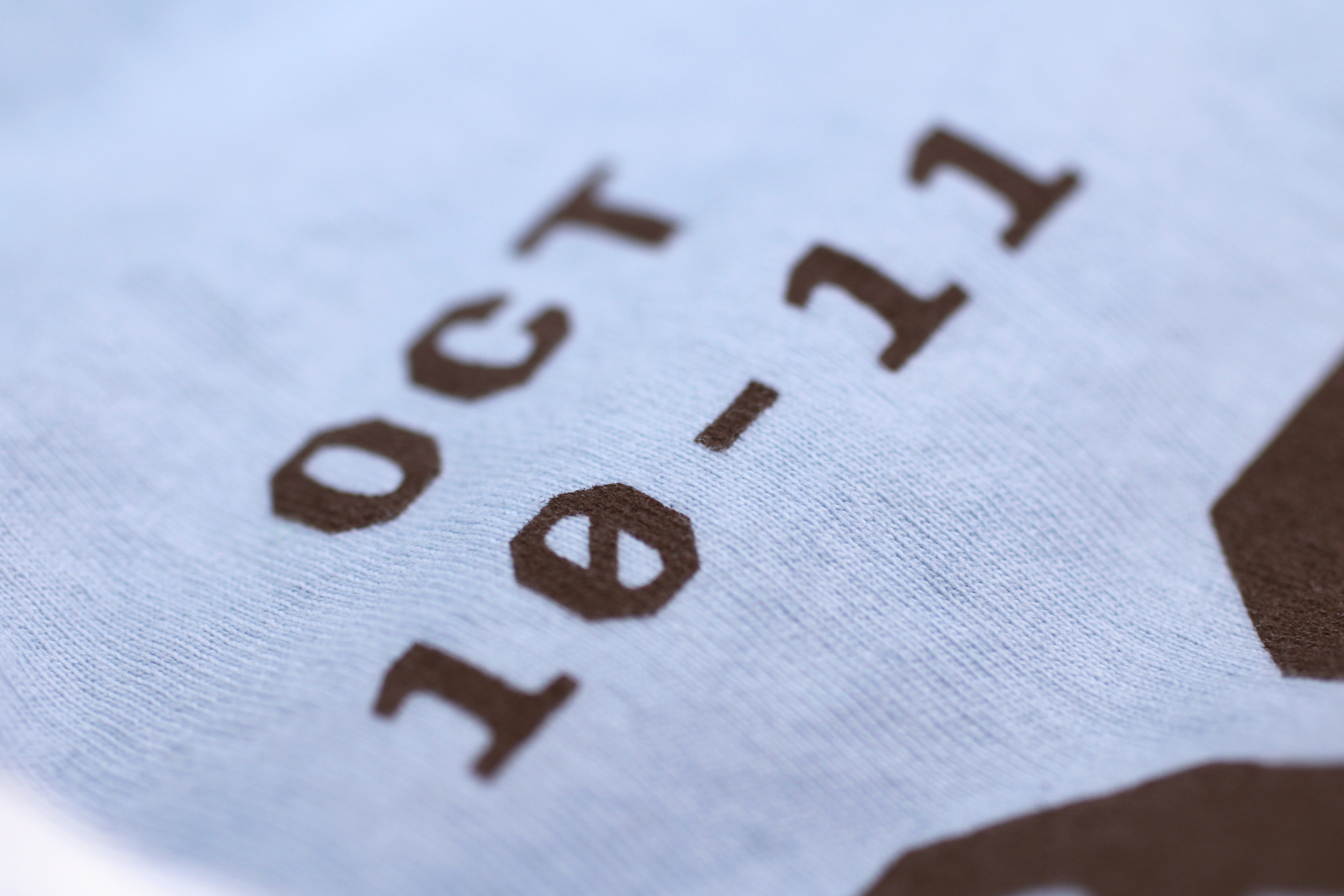
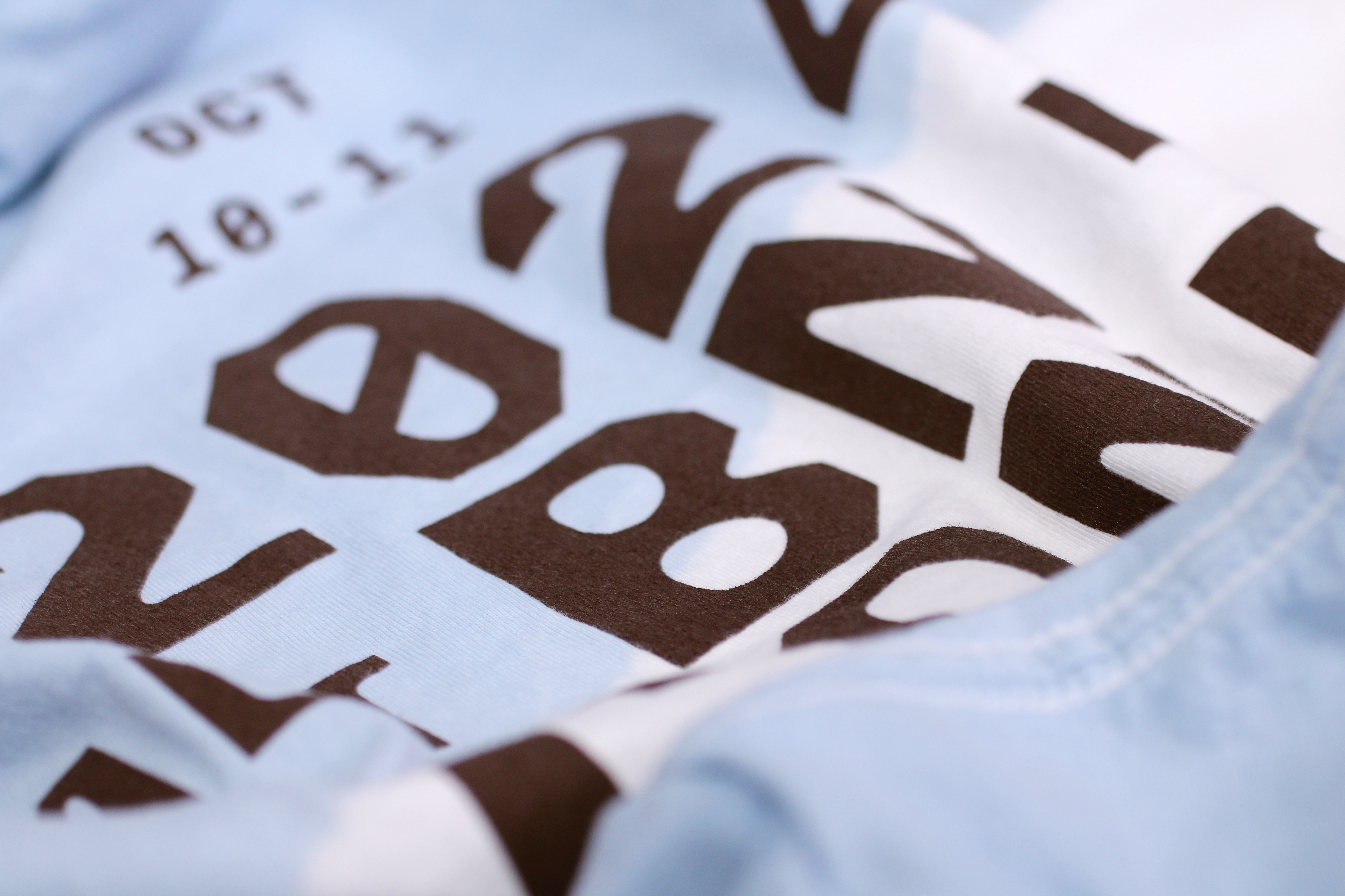
T-shirt, front and back.
Back of T-shirt.



The Truck Chronicles
We still have a few more things to go through but with the t-shirts being done, this concluded our time in the truck so here are some non-scientific stats.
Badges
For the badges we wanted to take a different approach as to how we would interpret the layering effect in part because we didn’t want to just repeat what we had already done with the program covers, tote bags, and T-shirts and in part because we needed something sturdy that could last a couple of days of wear and tear. We recreated the layering of the mountains through three different colored papers that were laser-cut to match the mountain peaks, and each layer was printed with the logo lock-up in the exact same place so that the final effect would be the same as on the website and the other materials of having the logo “floating” on top of the mountains and sky with the information of each attendee printed on the “snow” part.
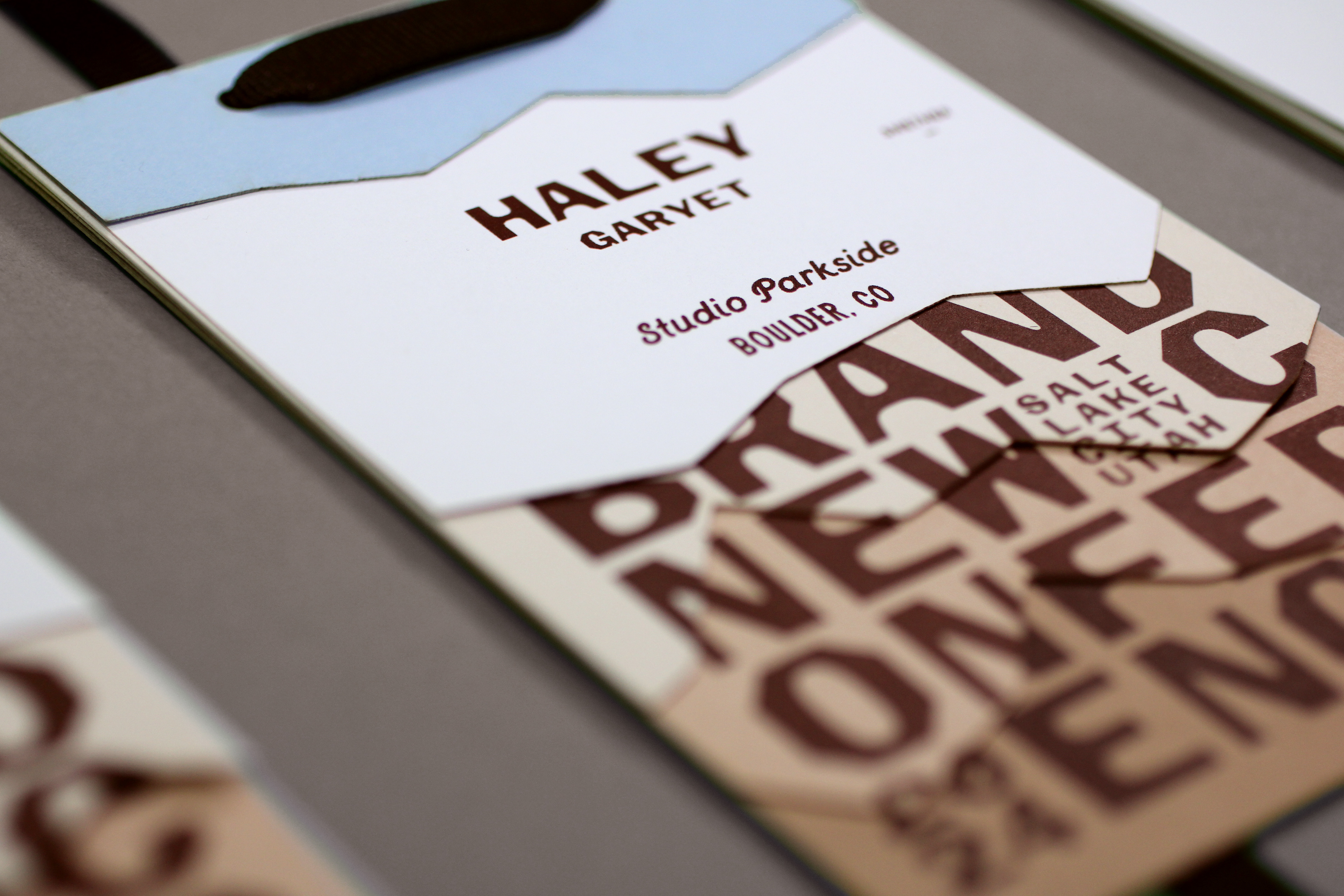
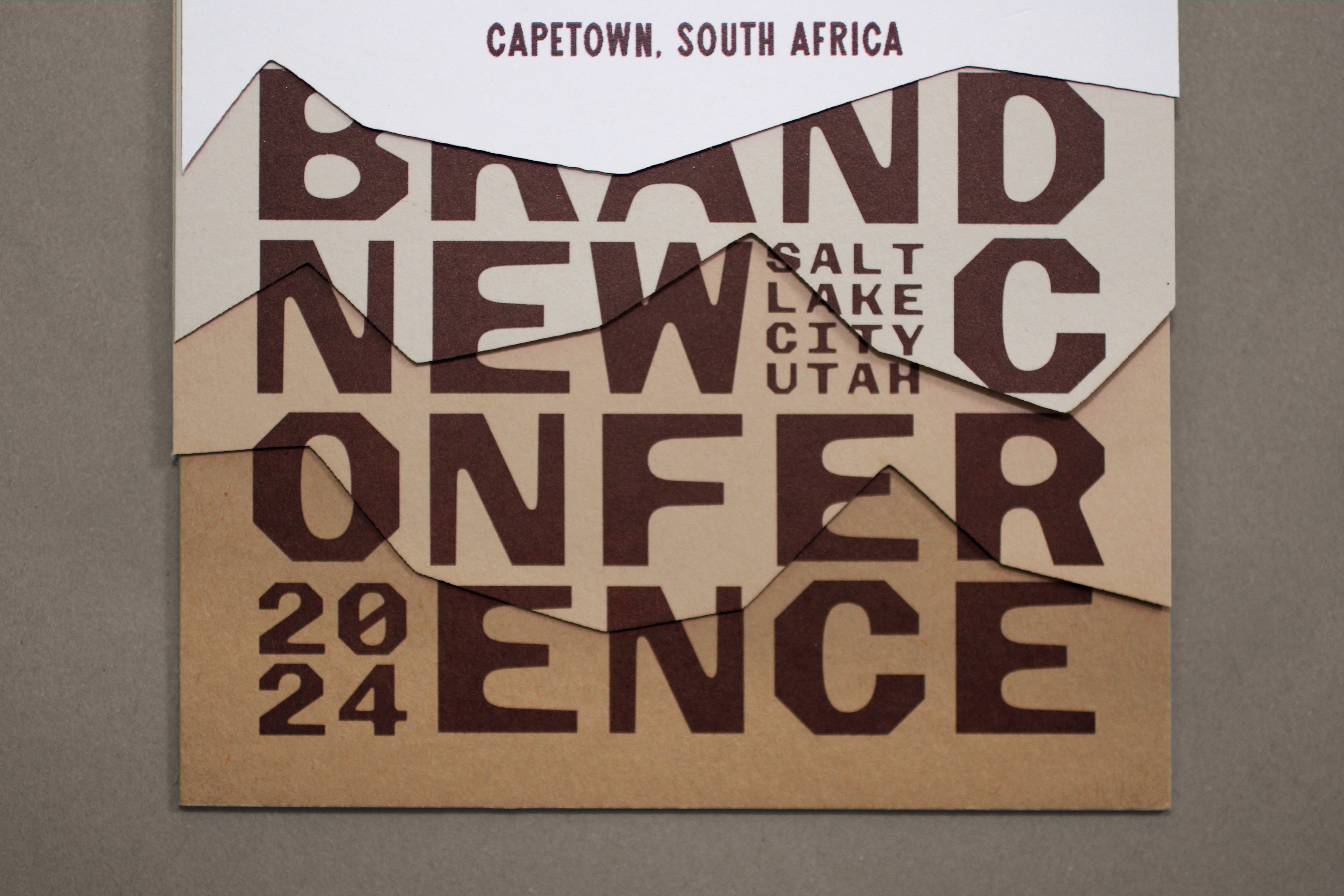
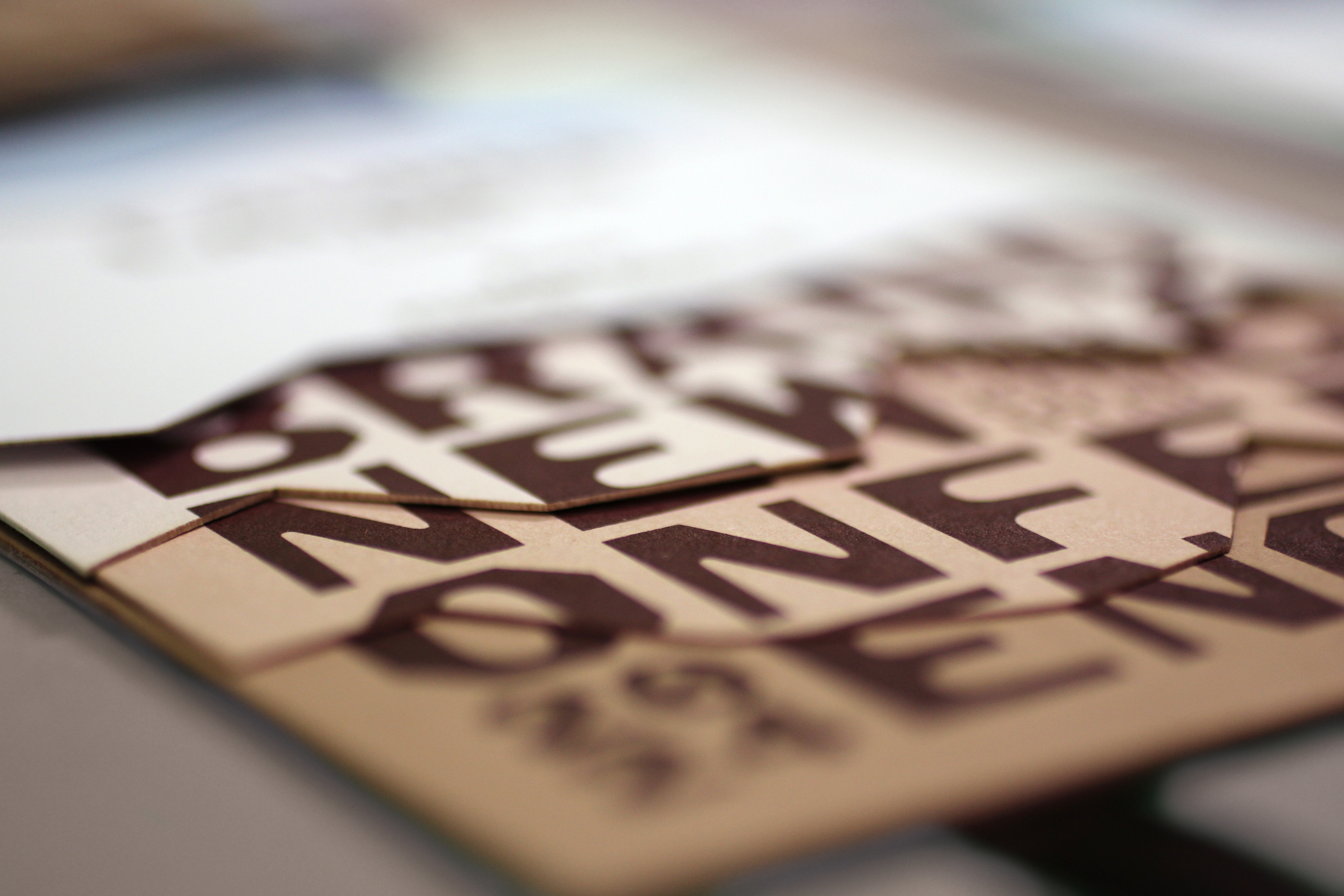
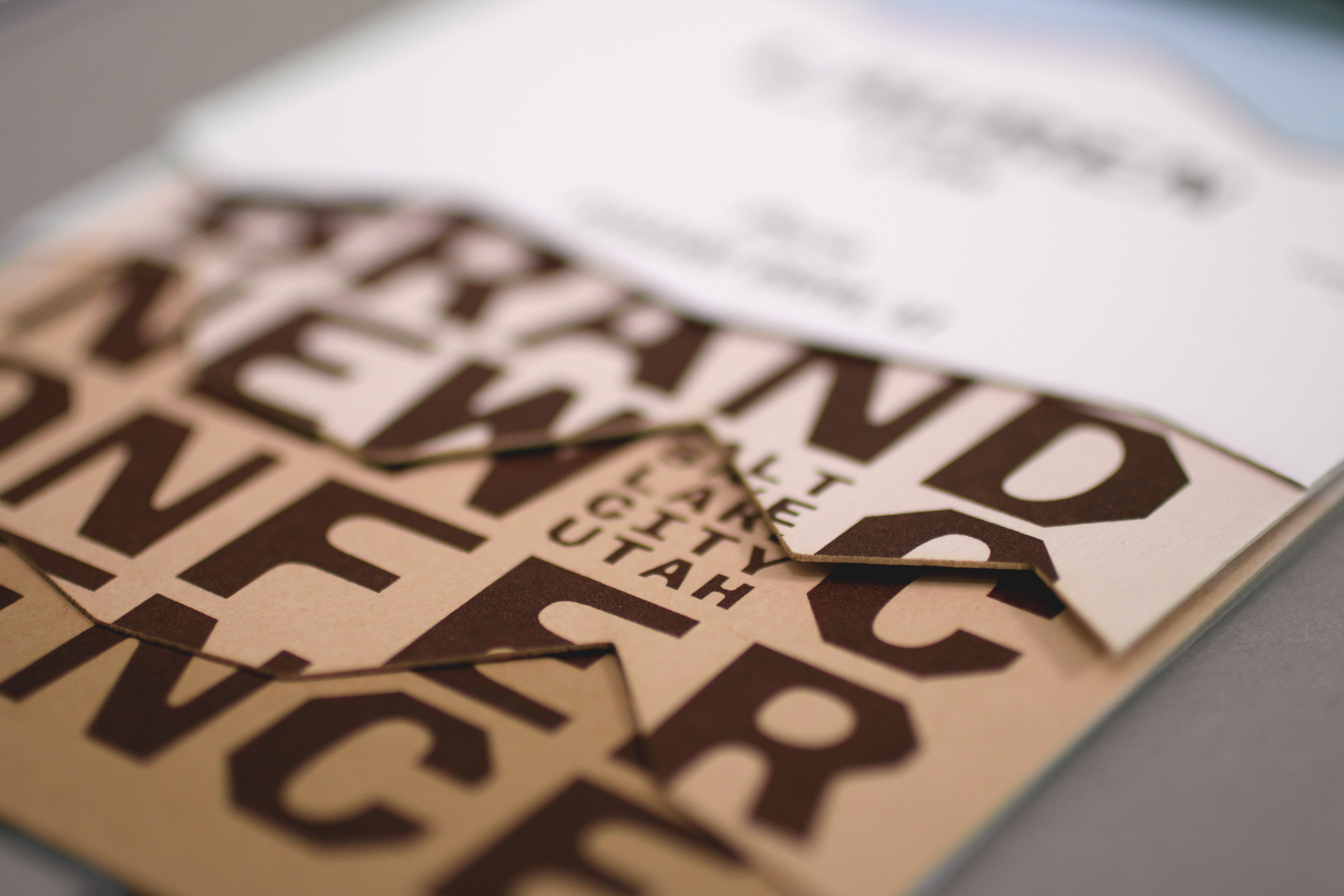


Badges.
Each mountain layer had eight different cuts and, at the event, attendees could make their own composition by choosing a variation for each layer.
Attendees building their own landscape.
Wristbands
To speed up the check-in process this year — as it usually requires finding each attendee’s badge as they arrive — we gave people a wristband so that our staff and the venue’s staff knew that people had checked-in and they weren’t just random people coming in from the street. Then they could get their badges anytime after that. The process worked wonders and the wristbands turned out slick. If you need a vendor for these try Arnett Credentials — not a paid placement, we are just happy customers who found one good vendor among a confusing amount of online vendors.
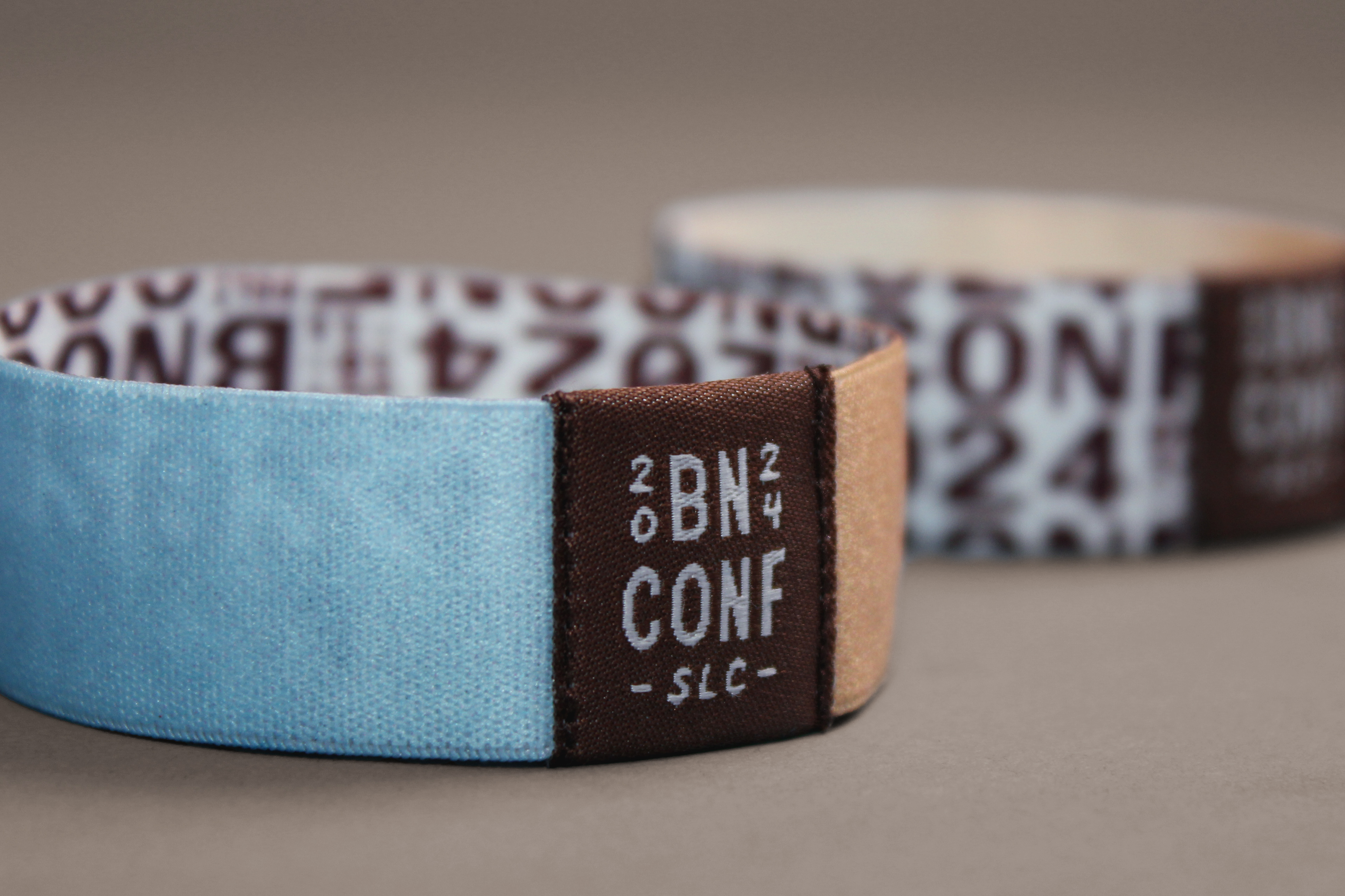

Wristbands.
Stage Letters
This year we couldn’t hang things from the sides of the screen, and to be honest, that’s okay because it is very stressful to hang things from theater stages so we committed to keeping things at ground level, which gave us some more flexibility. Similar to the badges, we took a 3D-layered approach and constructed each letter through five separate layers that, when seen from the front, would look like the mountains and sky in the rest of the applications. We used 2-inch insulation foam to cut the shapes and then we painted them accordingly.
Various pieces of letters laying around everywhere.
Stage letters on site.
Close-up humans for size relationship. Letters are 4-foot high.
Angled views that show the letters “out of focus”.
A more moody look.
Moral of the Story
tl;dr: Design is a process.
Longer version: Look at where we started with the t-shirt (left):
T-shirt “sketch” and finished product.
How do you go “Yes! That’s cool, let’s go down that path” and end up with something that actually looks like something? It’s half leap of faith and half stubbornness to get there. It’s about trusting the process… even when we actually had no idea what the process WAS. There is no guidebook for stuff like this, so for us the underlying process is to test things and troubleshoot them until as many pain points are removed — not a lot in our case as there is a lot of pain involved — and there is a lot of troubleshooting. We went through STACKS of tests.
A stack of tests.
Then against all odds we produce, produce, produce.
From “sketch” to finished product.
More than other years, we took a strong leap of faith with each item as the initial “sketches” were far, FAR from perfect but we could visualize in our mind how they would turn out. We are not by any means implying any of this is the best designed and produced thing ever and we are not looking to pat ourselves on the back. This is more a reminder that design takes time, and iteration, and refinement, and the willingness to shift gears when needed.
